Teaching
Redesigning the shopping experience for the sales force
How I implemented the Design Sprint methodology to redesign the internal shopping Web App of Videotron.

Title
Our methodology was failing. It was unexpected, because the project team had everything needed to succeed. Or so we thought.
We had a short deadline. We had eight weeks to deliver. To compensate for this short timeframe, Videotron had given us all the resources needed. But after 3 weeks and no progress to show we had to change something. That’s when I introduced the team to the Google Venture Design Sprints methodology.
Part of the following use case have been omitted or alter as to comply with my non-disclosure agreement. The opinions express in this text are mine alone and do not necessarily reflect those of Videotron.
A faster and smoother shopping experience for the Videotron sales force
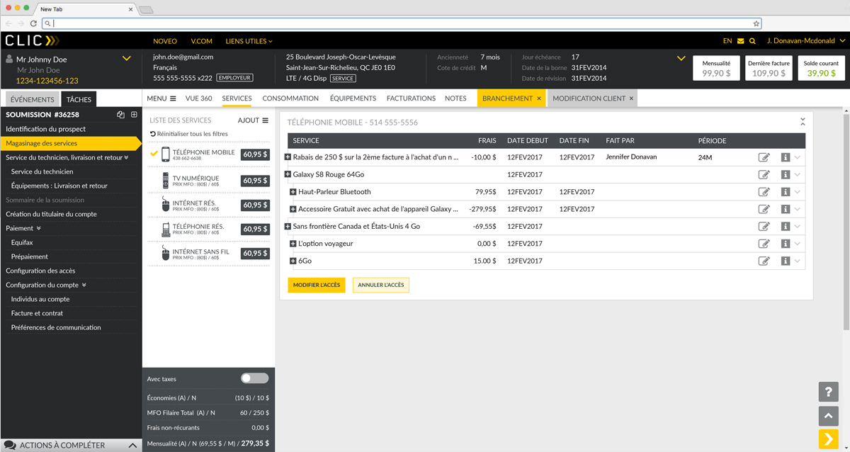
In 2016, and after 12 years, Videotron decided it was time to redesign their CRM tool. Part of the tool, is a section used for online shopping. It is destined solely to the Videotron sales persons in stores or over the phone. They use it to assist a customers when she wants to buy a new phone, change her internet plan, and remove a premium TV channel. The objective was to rethink the current shopping experience of the CRM tool.
On top of a tight deadline, the main constrain was that the back-end could not be touched. All the user experience improvements had to come from the front-end redesign.
The goals:
- Allow the employees to sell mobile phones, internet plans, TV channels, and accessories more easily
- Improve the speed and the logic the workflow, without touching the back office
- Have a corporate tool close to the online shopping experience of the .com website. It would allow the sales persons to have a consistant experience with the one of the customer. And it was also in case the screen had to be shown to the customer, during a store purchase.
The solution:
a web app that would be flexible enough to cover the need of the phone representatives and of the sales persons in the shop. The app had to be faster without changing the performance of the back-end.
The team:
for the first Sprint, I put together a team of nine people : the product manager, who act as the decider, an architect, a business analyst, four users with years of experience using the current application, one UX designer, and I, endorsing the facilitator role. Those nine people were in the same room during four straight days. Other people did also stepped in the room from time to time, as experts, to share their input.
For the three the subsequent Sprints, remained in the team at all time, the product manager, two users, one UX designer, and me. The architect, the business analyst, and any other relevant resource, did stepped in the room as needed.
My role:
Design Sprint Facilitator and UX Designer.
I led the Design Sprint, co-designed the shopping experience onlongside another UX designer, creating wireframes and interactive prototypes. I also led the four testing sessions that were happening on the last day of each Design Sprint.
The company:
Videotron is a Canadian integrated telecommunications company active in cable television, interactive multimedia development, video on demand, cable telephony, wireless communication and Internet access services.
In need of a simpler process and more freedom
On the morning of the first day, we talked about our goal. This was pretty easy because we already had a good understanding of what needed to be achieved. It was agreed that we could not design the shopping experience for the four different service type offered by Videotron (Mobile, Internet, TV, Residential Phone and Multi-Products). We decided to focus on the Mobile first. After a quick round table we ended up the following:
How might we make the current Mobile shopping experience faster, easier, while adding upselling options
But in order to reach this goal we had to understand the current pain points of our users. We used a method called “How might we” questions to turn those challenges into opportunities for design. Seeing a challenge positively suggest that a solution is possible.
As I was leading the discussion, I suddenly realised how critical it is to have a diverse team, that brings different perspectives, expertises, and skills. Having a business analyst, a technical architect, several users and a project manager in the same room creates brings the different perspectives needed to see the whole picture. Everyone was bringing something different to the table and completing each other.
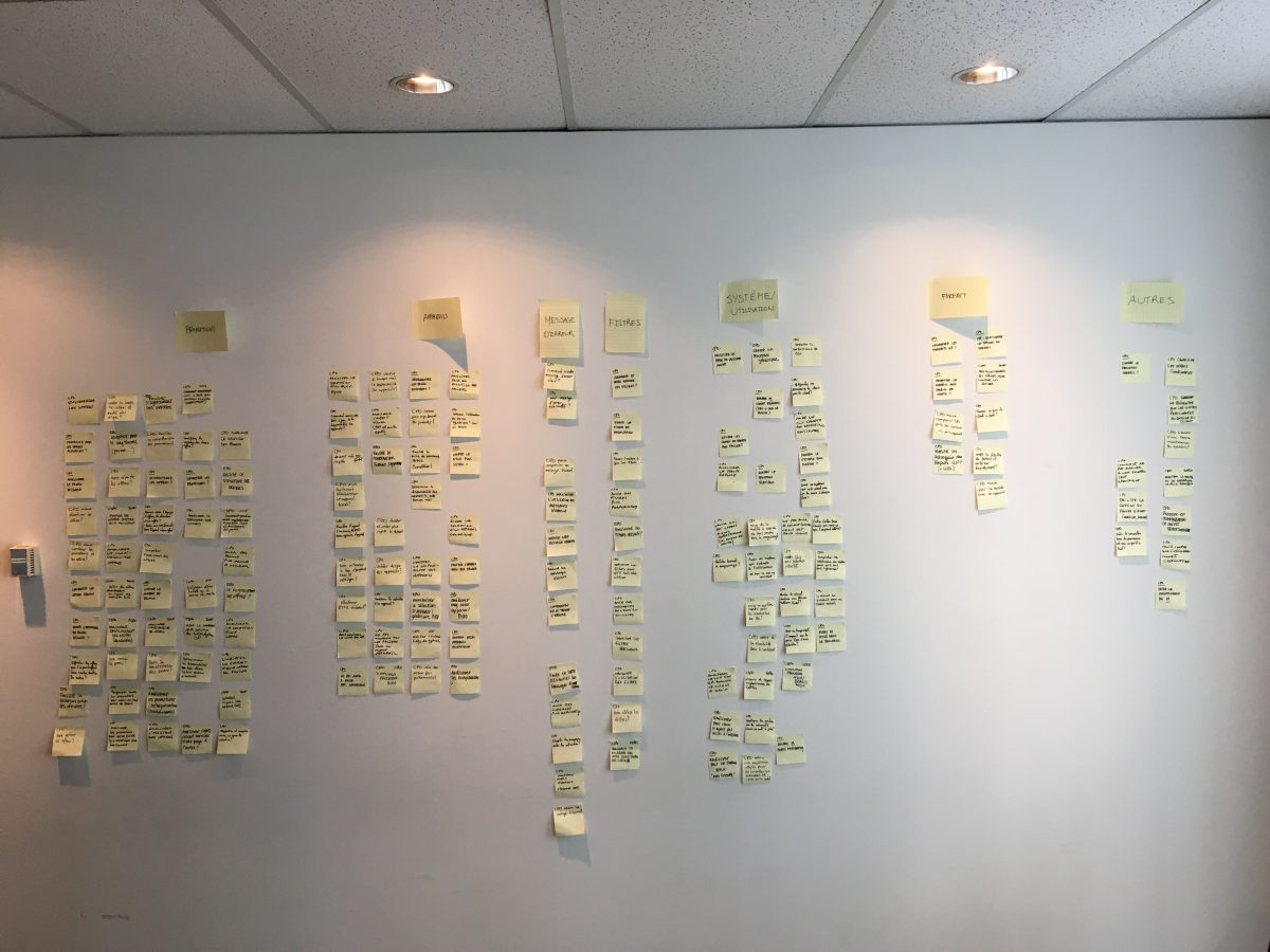
Bellow are some examples of the problems that were raised by the team:
How might we have error messages that guide the user?
The error messages in the current application were ambiguous, were not placed close to the source of error, and did not suggest any possible resolution. The new app needed to fix those limitations.
How might we improve the current filters?
The current filtering was very basic and came late in the user flow. We needed to provide the users with a wider range of options. And we needed to provide those filters as soon as possible.
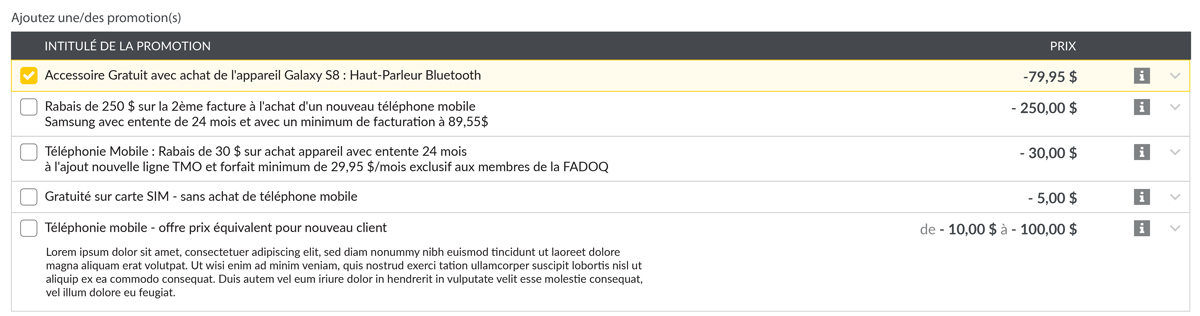
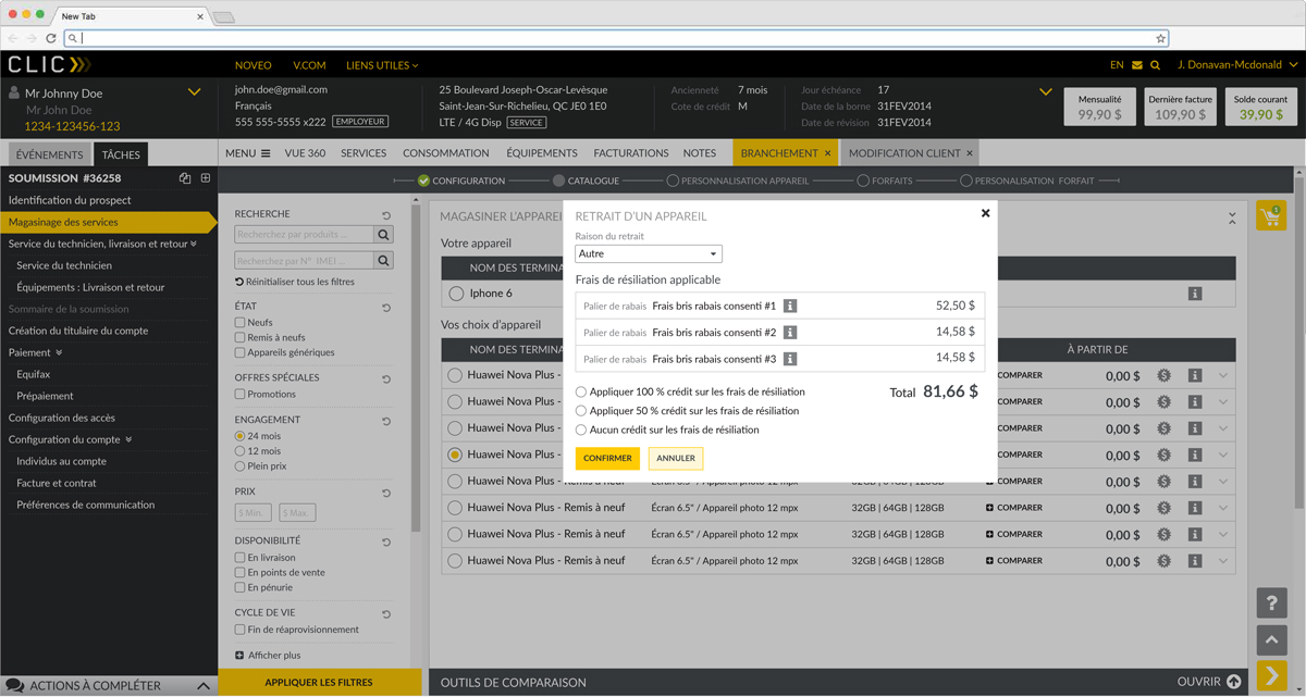
How might we standardize the promotions?
The way a promotion was built and displayed in the app was not consistant. It made it hard for the user to know if he could offer the promotion to a customer. And to make matter worth, the app was validating the promotion in the last step. It meant that if a promotion was not compatible with the Mobile plan the customer had chosen, the app would notify the sales person after he had finished his sales pitch.
How might find the right equipment for the selected device?
The current app had a very large number of equipment in its catalog and therefor was very slow to load and browse. Also, there was no easy way to narrow the list of items depending on the current selection. The new solution would need to make this process fast, automatic and easy.
Next was the user journey mapping. This is where the magic happens. It is the backbone of the project: on a big white board, you lay out your starting point and your desired end state. Then you fill everything in between.
You start with the actor(s) on the left and you put the result on the right. Then you add the different steps in between and connect them together, using arrows. The map should be simple and contain no more than 15 steps.
After a slow start, the team built a very well structured user journey. We took different approaches: does the client need a phone, a plan or both? And what if the client already has a phone? How do we bring all the scenarios to the same conclusion?
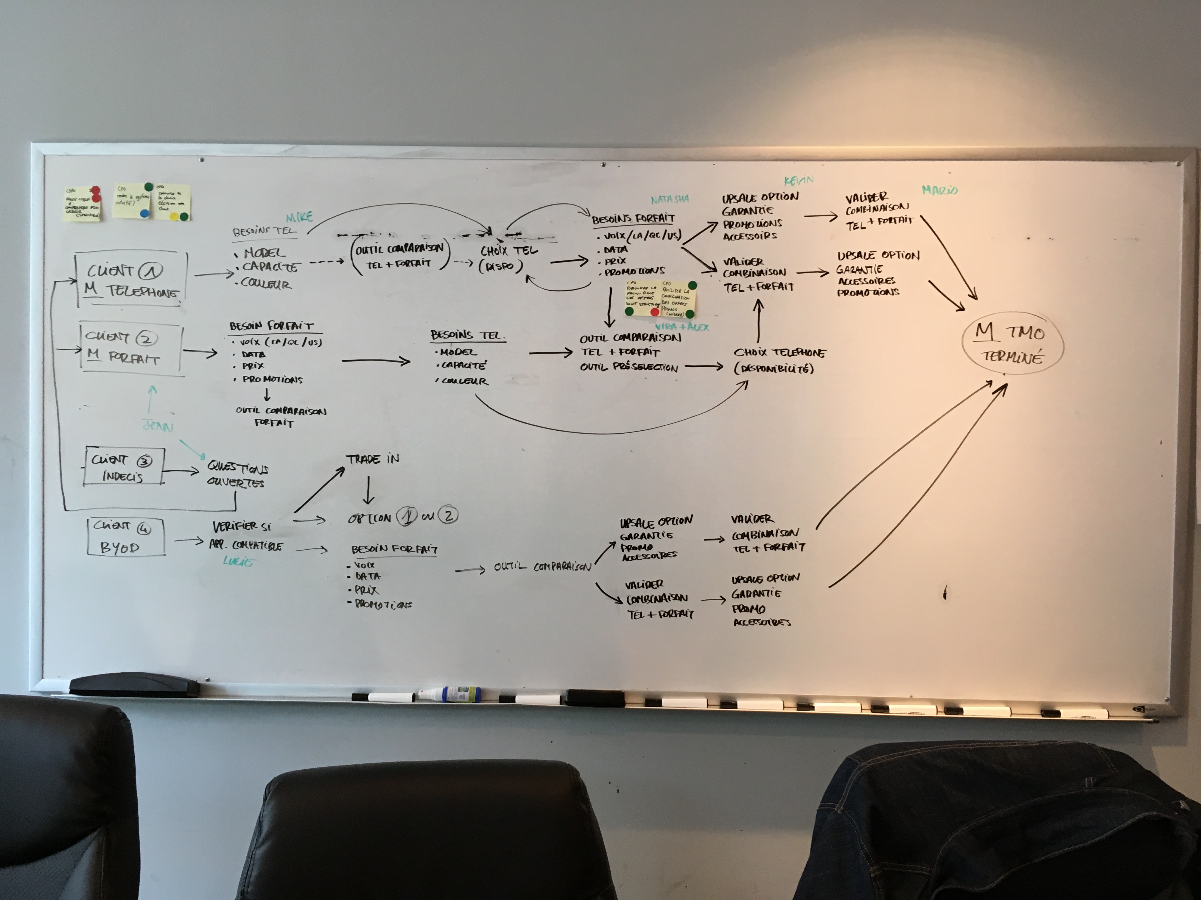
Plan first or device first?
To make sure to bring each customer to the same resolution, we needed to provide our users with coherent screens and powerful tools, no matter the scenario. Everybody did grab a pen, a sheet of paper and started taking notes using everything that has been said so far: the sprint questions, the user journey, the HMW questions… The notes turned into ideas. Ideas into sketches. And the sketches into wireframes. Apart from the other UX designer and I, the people in the room were not used to draw wireframes, especially not on paper.
We used the Crazy 8 method, and it produces amazing results. Everybody did play along and the solutions were on point. At this moment, I realised that it is foolish to think sketching should be reserved to UX designers. Granted, some sketches where messier than others, but the concepts they contained were sometimes more interesting than the ones created by the UX designers. Partly because their designs were fuelled by years of using the application.
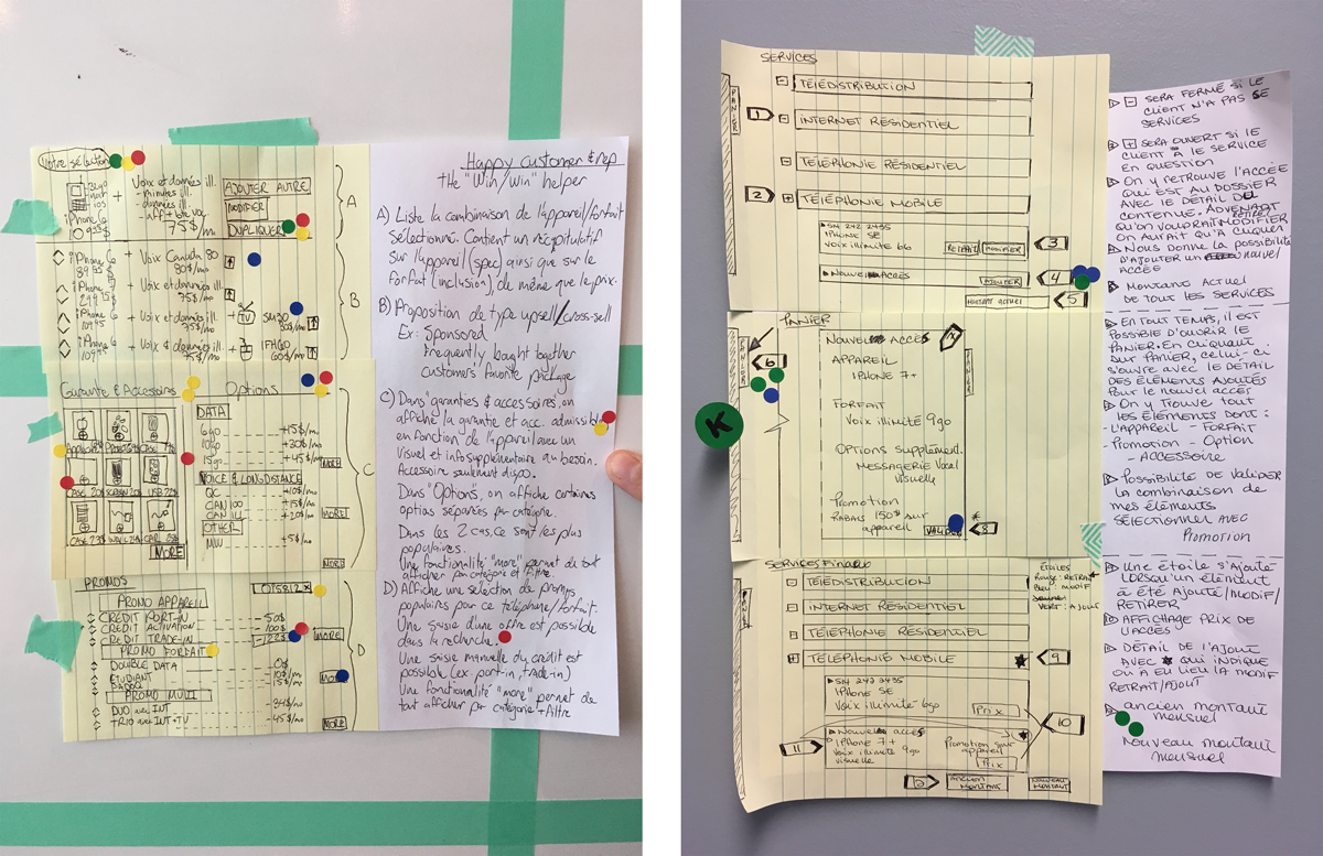
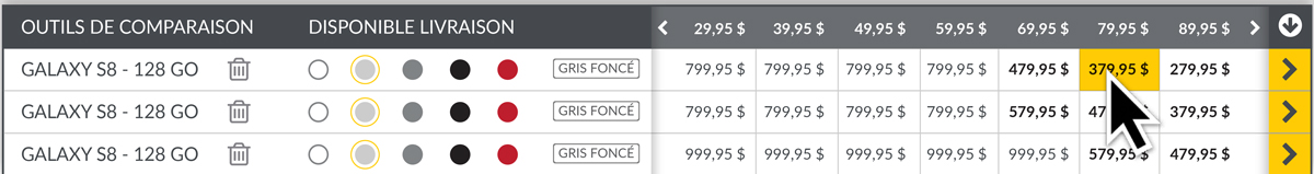
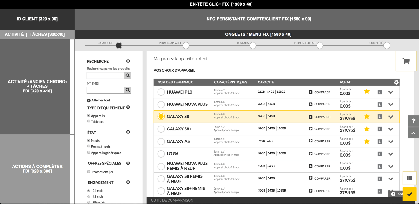
Comparator tool
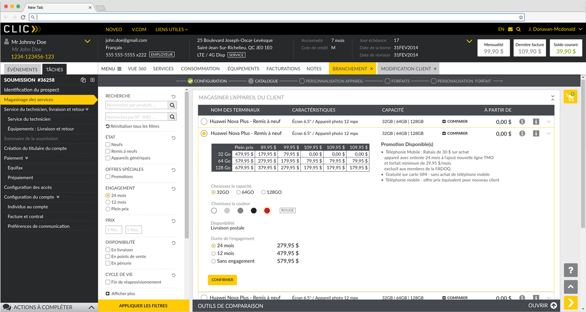
One person designed a simple but effective comparator tool to provide the sales person with a price table of a device that fluctuates depending on the memory size of the device and the different monthly plans.
Putting the promotion forward
One person thought it would be helpful to bring only the relevant promotions on the Mobile device detail page, and on the Mobile plan detail page. Whereas, until now, we had thought that all the promotion should be displayed on a separate step.
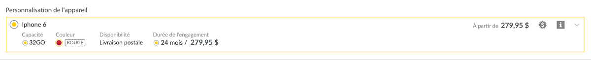
Default with custom options
One person found a way to have all the default option selected automatically but give the freedom to the user to modify them to customize the customer’s choice. With a simple dropdown, the user could have access to more colours and size options without going back to the previous step.
To make sens of it all, we had to arrange the wireframes into a coherent storyboard. Selecting the winning sketches, we weaved them into our whiteboard to follow our user journey. At this point you were already iterating. By linking a scene to another, we were highlighting the weaknesses of a screen right away. The good thing was that we were also able to correct them on the spot.
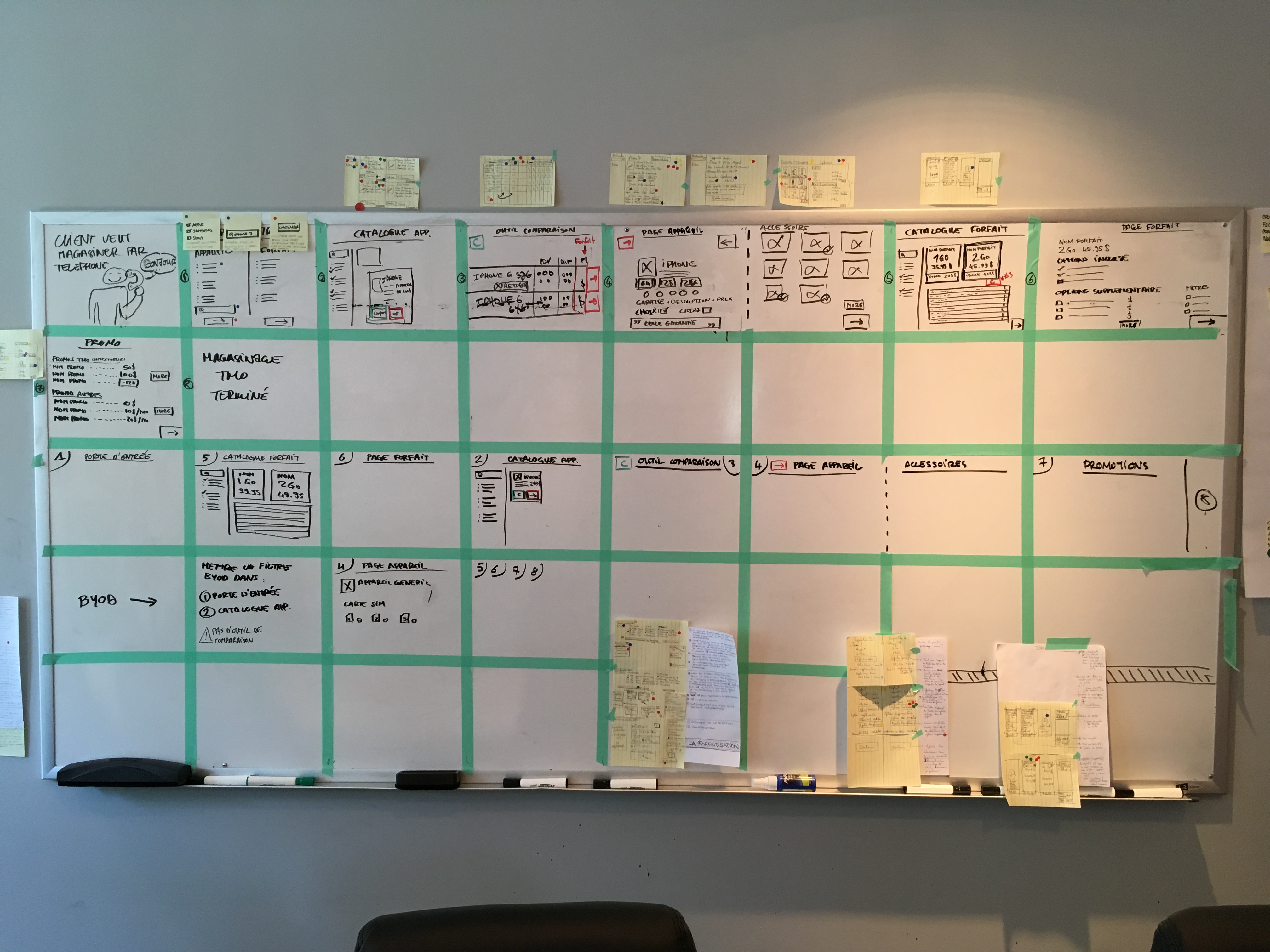
It is at this point, that we realized our initial “one size fits all” approach would not work, and that in order to simplifying the process, we had to have several entry points. Simplifying did not mean one process with less steps, it meant several entry points with shorter steps.
But with different journey possible, we needed to make sure that each screens could be reused as much as possible. We had the intuition that it would not be too much work to make a screen work in different flows.
How might we reuse the screens no matter the entry point? We designed each screen with two states, to adapt the display to the selected flow.
Creating a dynamic prototype
For the prototype of our first MVP; we chose the two most important entry points:
- the customer wants to shop for his mobile device first
- the customer wants to select his plan first.
Until now, we rejected the idea of having two paths because we thought it would give us twice as much work. But here we realized we could just reuse the same five screens in the two different paths, by organising them in a different order. And only two screens needed slight modifications for the second path to work.
Using Axure, the other UX and myself, started creating the prototype by following the storyboard closely. It was a very fast process because the information contained on the whiteboard and in the paper wireframes left little unknown.
We built the first flow: Mobile device selection, Mobile device customization, Mobile plan selection, Mobile plan customization, validation step.
Then we built the first flow: Mobile plan selection, Mobile plan customization, Mobile device selection, Mobile device customization, validation step.
The Mobile device customization and the Mobile plan customization screens had to be tweaked a little. Some information had to be displayed or hidden depending of the position of the screen in the flow. But nothing that could not be done with a little of javascript and CSS.
At the same time the rest of the team was writing the test scenarios. They covered all the situations that regular sales person encounter during a phone call. We tried to cover all the main pain points.
Testing with real users
On Friday we arranged to test the prototype with 5 real users, a mix of sales people working in the stores and over the phone.
The setup for the tests is as follow: two rooms, one big and one small. The test was being conducted in the smaller room with the user and I, while the observation was taking place in the bigger room, where the whole team gather around the TV to observe the test in real time and take notes.
Each test lasts between thirty and forty minutes. Most of it, is the user testing the prototype and describing what he sees or understands. At the end, we reserved five minutes to answer questions and review what has been done.
The result
The feedback were amazing. Our intuition paid out. The users did find value in having different entry points. They were stuck on bugs and concepts that were easy to correct. And we didn’t discover any game changing issue. We took note of everything that needed improvement.
We had achieve in just four days what we could not in four weeks. We went back to the first whiteboard to reflect on the success. The one with the sprint goal and the sprint questions. Out of the seven questions, we were able to answer five positively.
As for our goal, we were able to reach it, except for the upselling part.
Repeating the process for the other products
Sprints are made to iterate. We did successfully answer a lot of questions with our first Design Sprint, covering the whole process for Mobile. But we needed to create the same for Internet, TV, Residential Phone and Multi-Products. The following weeks, we kept using the Design Sprint methodology to design the other products. For the other products, we followed the same approach, but with one entry point: device selection and customization, then plan selection and customization. For TV, we had to design a new concept for selecting the TV channels. But apart from that, we reused the screens developed for Mobile, with just a few adjustments.