Supply chain
Going paperless: setting the standard for a global transformation
Designed the digital transformation of a centuries-old company, moving the paper process online, deploying the first MVP in 6 months, setting the standards for the paperless revolution.
The Challenge
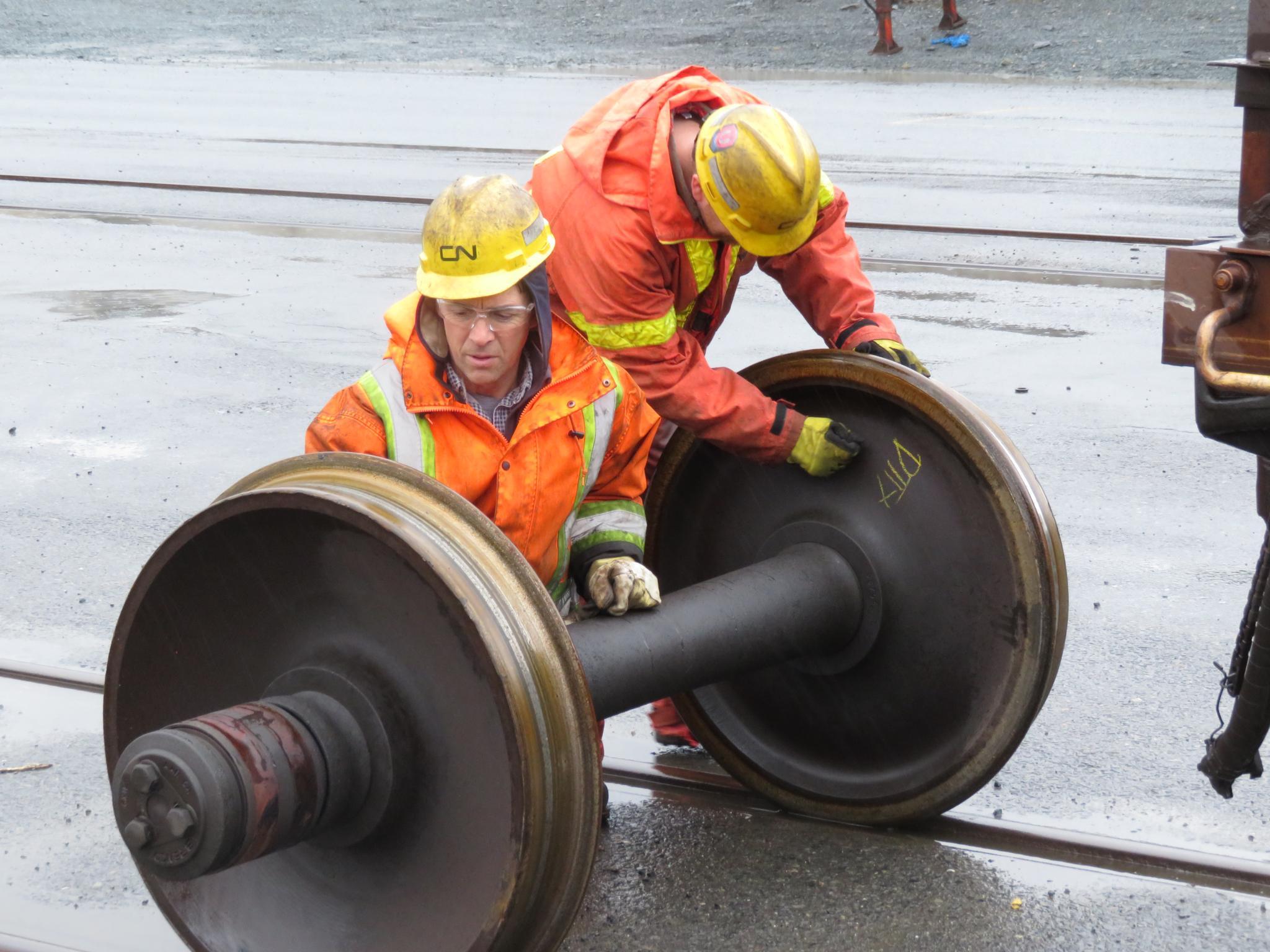
Canadian National Railway (CN), a 25,000-employee freight railway serving Canada and the United States, faced a critical operational bottleneck. Car mechanics were manually recording repairs on paper forms in extreme conditions—temperatures dropping below -40°C, rain, wind, and snow—then faxing these forms to billers who manually re-entered the data. This antiquated process created a cascade of problems:
- Billing delays of weeks to months prevented timely revenue collection
- Error rates of approximately 20% due to illegible handwriting, wrong codes, or missing information
- 6–7 hours per day per biller spent correcting errors and manually entering data
- Inconsistent processes across the network, with each yard adapting forms to their needs
- Frustrated billers who spent their time fixing mistakes instead of processing invoices
For an industry as old as the railroad, going paperless wasn't just about modernization—it was about survival.
My Role
As Lead UX Designer, I spearheaded the research, design, and testing of CN's first mobile application to replace paper forms. Working alongside another UX designer, I was responsible for:
- Leading field research and establishing CN's first-ever usability testing practice
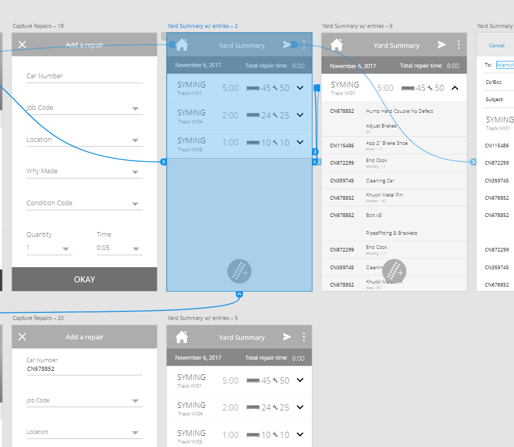
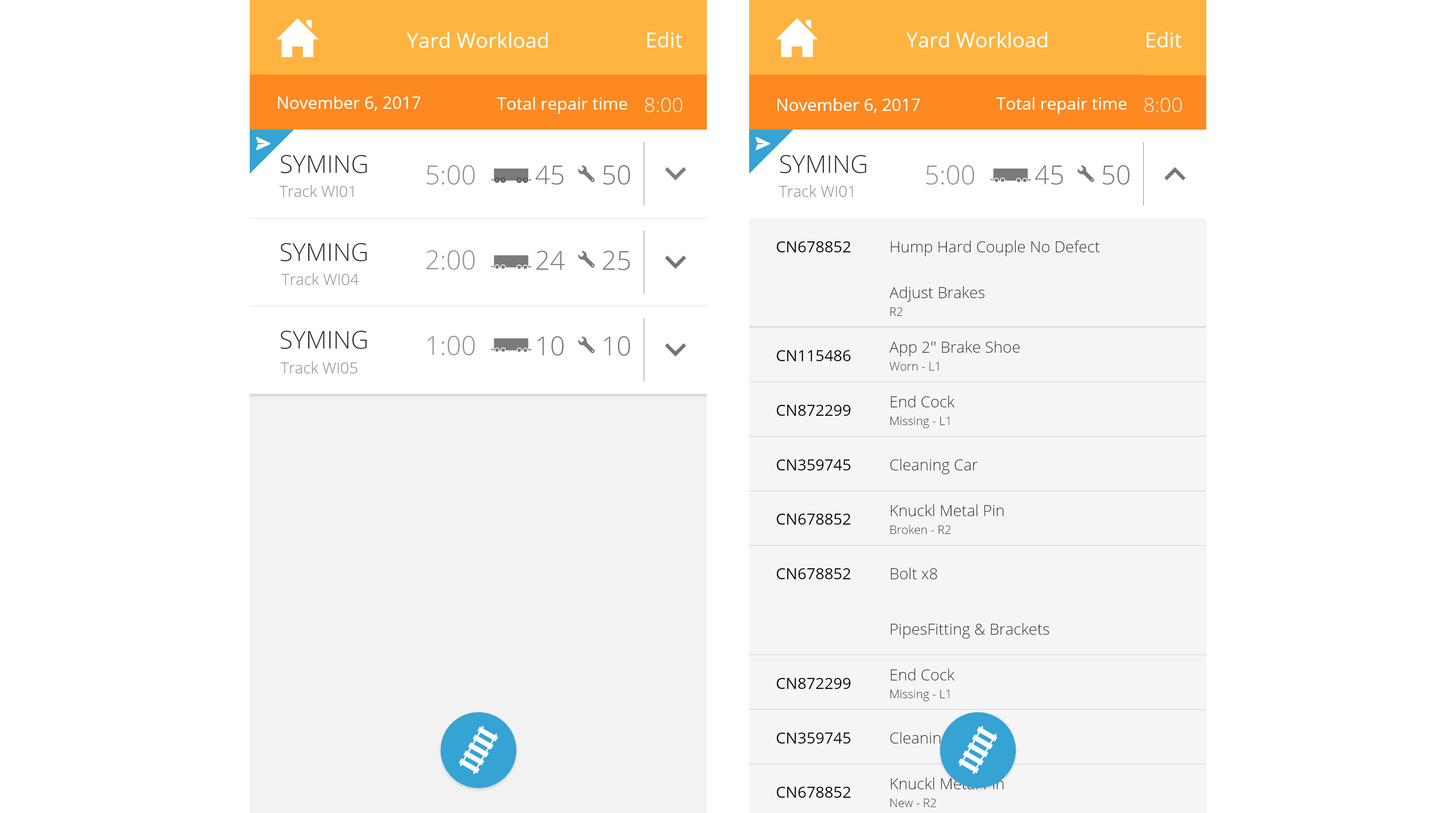
- Designing critical workflows including the Home screen, car check-up process, time recording, and Yard Workflow
- Collaborating with a cross-functional Agile team including Scrum Master, Product Owner, developers, testers, and functional designers
This project was groundbreaking for CN: their first paperless initiative, first Agile project, and first application with user-centered design at its core.
Discovery: Uncovering the Real Problems
Field Research Revealed Critical Insights
After just 6 months of development, I traveled to Halifax with my co-designer for two intensive days in the field:
- Day 1: Conducted usability testing with 5 mechanics who had never seen the app
- Day 2: Shadowed mechanics through their daily work via contextual inquiry
What we discovered challenged everything we thought we knew:
- No standardization: Each yard operated differently, and even within the same yard, mechanics recorded work inconsistently
- Adapted paper forms: Yards had customized forms to match their reality, not corporate standards
- Multiple user types: Yard mechanics, field mechanics, and wheel pit operators all had different workflows
- Knowledge burden: Mechanics needed to memorize dozens of repair codes, part codes, and location codes—a significant training investment
- Billing expertise gap: Only a handful of mechanics understood the billing process; billers silently corrected errors rather than returning forms
The Core Problems to Solve
- How might we unify the process across all yards and user types while respecting their different workflows?
- How might we reduce the cognitive load on mechanics and transfer the biller's expertise into the application?
- How might we make the app intuitive enough to require zero training in an industry already heavy with training requirements?
Pioneering Usability Testing at CN: The Halifax Sessions
Testing Setup
- 5 mechanics who had never seen the app (representing diverse experience levels)
- 45–60 minute sessions per participant
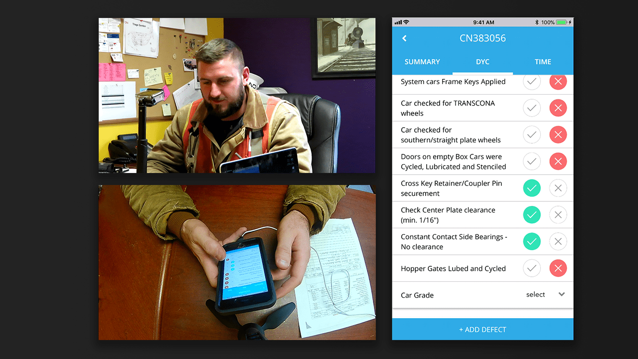
- Dual-camera recording: One camera on the user, one on the device screen
- Screen mirroring for detailed interaction capture
- Two-person team: One facilitator, one observer/note-taker
- Real scenarios based on actual daily workflows
Three Testing Approaches
1. Lab Testing (First-Time Users)
Mechanics who had never seen the app were given realistic scenarios to complete, revealing intuitive vs. confusing elements.
2. Field Observation
Following mechanics using the app in their actual work environment revealed context-specific issues we couldn't have anticipated in a lab.
3. "Cold Turkey" Testing
Mechanics with no training were asked to use the app with previously filled paper forms, testing if our "no training required" goal was achievable.
The Impact Was Immediate
The testing videos were so revealing that they were shared with VPs and directors across CN. Leadership saw real users struggle with specific features and succeed with others—more convincing than any presentation deck could be.
Result: Usability testing became formalized practice across CN and expanded to other projects.
Design Strategy: Innovation Through Intelligent Mapping
We weren't digitizing a form—we were transforming a process. Our research drove a set of bold design decisions:
1. Two Distinct Workflows for Different Contexts
Yard Workflow (Fast-Paced): Quick repairs, high volume; non-mandatory fields to maintain flow; information can be entered progressively; highlighted codes relevant to yard work.
Shop Workflow (Detailed): Heavy reconstructions lasting hours or days; all fields mandatory at submission; linear, structured flow; different code prioritization.
2. Intelligent Code Mapping: The Game-Changer
Recording a single repair required entering 5–10 different codes. We discovered relationships between these codes that had never been formalized.
The innovation: By entering just the first few codes, the app could auto-select the remaining ones based on these relationships.
Impact: Reduced manual data entry by approximately 50%, eliminated entire categories of errors, and unexpectedly served as on-the-job training for mechanics learning the codes.
3. Offline-First Architecture
Remote locations meant unreliable cellular coverage. We couldn't let mechanics revert to paper when connectivity dropped.
Solution: Built the first MVP completely offline, enabling seamless switching between online and offline modes. This prevented work stoppages and ensured consistent adoption regardless of location.
The Halifax Testing Results: What We Learned
What Users Loved
[The app] is pretty straightforward and easy to use
- Easy team creation and car entry processes
- Understood car status and completion workflows
- Liked the "Did You Check" (DYC) feature for inspections
- Could enter individual time without confusion
- Send for billing was clear and intuitive
What Needed Work (User Concerns)
Looks too much like a corporate app
- Defect/Repair relationship unclear – terminology confused users
- Speed concerns – Unsure that app is going to be faster than paper
- Touch screen issues – dry hands in field conditions
- Safety concerns – worried the device might be distracting
Critical Issues Discovered
- Job code mapping bugs – prevented adding certain repairs
- Logout wiped all data – major frustration for mechanics
- Quantity/inches of weld was confusing and misleading
- Time picker was unintuitive – users didn't know to press "Set"
- Navigation felt clunky – back vs. cancel buttons confused users
Results: Measurable Transformation
Timeline to Success
- 6 months: Discovery to first MVP
- 3 months: Pilot phase across 3 yards with 25 mechanics and billers
- 3 months: Full rollout across the network
- 12 months total: From paper to paperless across CN's network
Quantifiable Business Impact
- Billing Efficiency: From weeks/months behind to near-instantaneous billing; 6–7 hours saved per biller per day; improved cash flow through faster invoice processing
- Quality Improvement: Error rate reduced from ~20% to <5%; eliminated illegible handwriting and missing codes; reduced back-and-forth between mechanics and billers
- Adoption Success: 85% adoption within 30 days in pilot yards; paper eliminated on day one in new yards; minimal training required
- Operational Excellence: Unified process across the network; offline mode prevented work stoppages; consistent satisfaction across releases; presented to CN's Board of Directors
The Human Impact
Carmen responded well to being included in the creation of the app. They felt listened to. They felt supported. They felt CN was doing the right thing.
- Mechanics no longer struggled with ruined paper forms in harsh weather
- Billers shifted from error correction to strategic billing work
- Knowledge transfer accelerated through intelligent auto-completion
- Standardization achieved without sacrificing yard-specific needs
- Company culture shifted toward user-centered design and Agile methodologies
Key Design Decisions That Drove Success
- Test Early, Test Often: We tested after just 6 months of development—early enough to make significant changes before they became expensive.
- Multi-Method Research: Lab testing, field observation, contextual inquiry, and "cold turkey" testing.
- Quantified Feedback: Prioritized fixes by frequency and severity across 5 participants.
- Rapid Iteration: Fixed 14 issues during the sprint that followed the user research.
- User-Centered from Day One: We observed, tested, and iterated before building.
- Respect for Expertise: The app adapted to mechanics’ workflows; intelligent mapping reduced cognitive load.
- Resilience by Design: Offline-first architecture ensured the app worked everywhere, always.
What We Learned Beyond the App
- Test with actual data earlier: Complexity surfaced only in the field.
- Involve billers earlier: Would have accelerated billing-side features.
- Bring users to HQ regularly: Faster validation and alignment.
- Document mapping logic: Formalize code relationships for future teams.
A Critical Business Requirement Emerged: Being on-site revealed a usability issue that triggered a new business requirement—something that would never have surfaced remotely.
The Power of Inclusion: Bringing users into the design process didn't just improve the app—it changed how they felt about the company's digital transformation efforts.
Legacy and Impact
- Established usability testing as standard practice across CN projects
- Proved Agile methodology could work in a traditional railway environment
- Demonstrated ROI of UX research through measurable business outcomes
- Created a template for future digital transformation initiatives
- Improved revenue collection by eliminating weeks-long billing delays
- Changed company culture around user inclusion and feedback
Most importantly, it showed that even in an industry as old as the railroad, user-centered design can drive profound, measurable change.