EdTech
Scaling Design Education: Engineering a Curriculum for 2400+ Students Globally
When remote bootcamp demand exploded post-COVID, we needed to scale fast. As Academic Program Manager, I engineered a curriculum system serving 2,400+ students annually—treating teachers, TAs, and students as three interconnected user personas.

Intro
Bootcamps are polarizing in the EdTech world. Some see them as career transformation tools. Others dismiss them as "Lower Ed" or scams. In the Design community, where most agree design education needs reform, Product Design bootcamps spark intense debate.
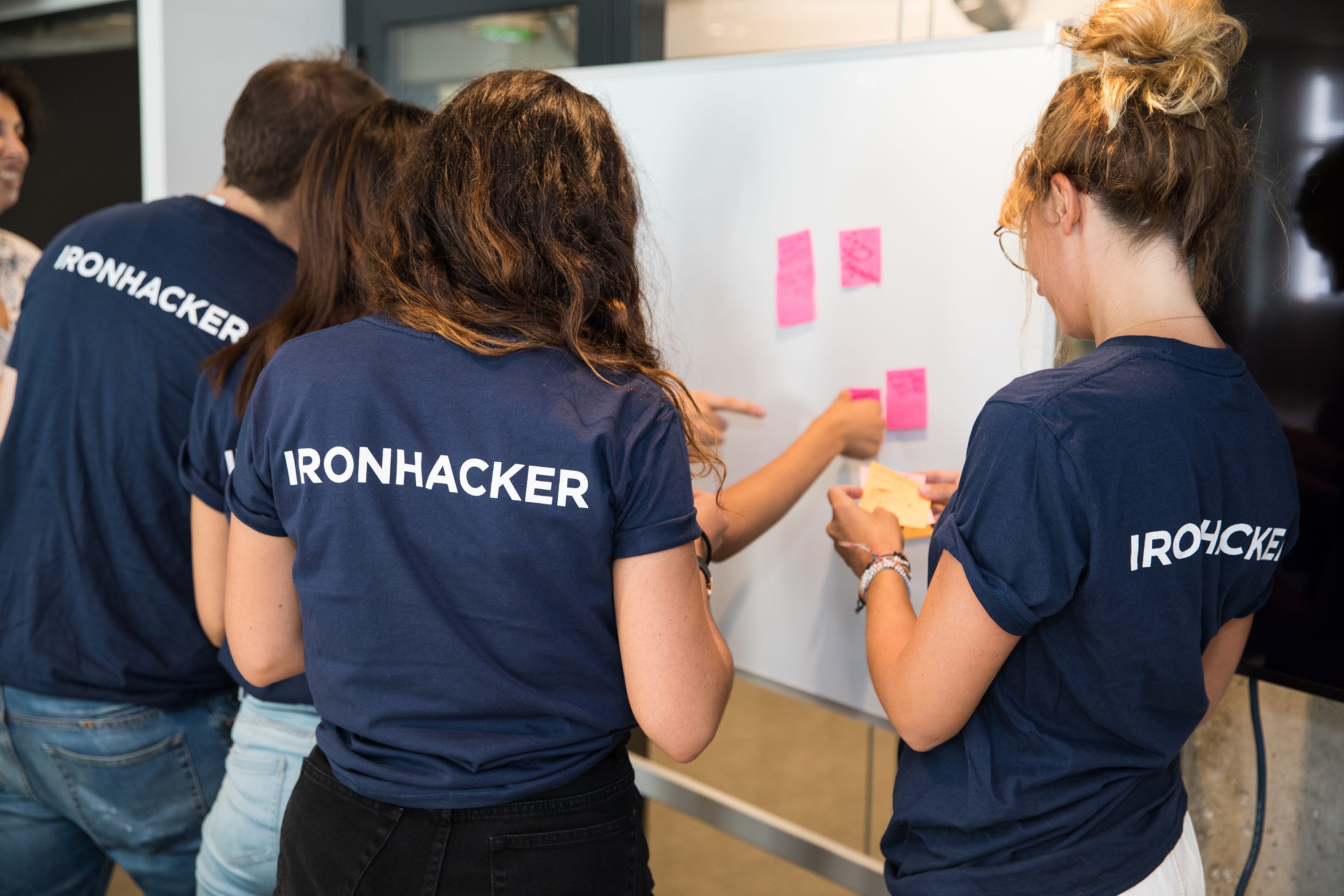
As Academic Program Manager at Ironhack, I never removed my designer hat. I approached curriculum development as a product design challenge: the curriculum was my product, and I had three distinct user personas—Teachers, Teaching Assistants, and Students.
In six years, Ironhack became Europe's #1 EdTech school and one of the top three independent schools worldwide. Across nine global campuses, we helped 6,500+ students transition to digital careers. During my tenure as Academic Program Manager (2021-2023), I supervised 2,400+ students annually while coordinating 20+ international instructors.
But my journey started differently. Before managing the program globally, I spent two years (2019-2021) as Lead Product Design Teacher at the Paris campus, teaching 200+ students across full-time and part-time formats, both in-class and remote. That frontline experience—pioneering remote design education during COVID-19 and managing a team of 4 Teaching Assistants—gave me invaluable insights into what teachers and students actually needed.

The Challenge: Designing Learning Experiences at Scale
Teaching Product Design to beginners means treating each student as a novice across multiple disciplines: art, business, strategy, psychology, technology, and problem-solving. Our challenge? Teaching them the right skills, tools, and methods to identify and solve the correct problems—in just 10 weeks. And doing this without formatting students into designer caricatures.
To become job-ready in 10 weeks, students needed to:
- Learn Design Thinking, User Experience, and User Interface Design fundamentals
- Practice with real projects to build a Product Design portfolio
- Mature their practice to become critical problem-solvers
But here's the twist: When Ironhack launched its first remote bootcamp during COVID-19, it wasn't an instant hit. The initial results were mixed, and demand was modest. But as we refined the experience and proved it could work, remote learning became the new norm. About 12 months later, demand started to explode. We needed to scale our curriculum to serve:
- 9 major city campuses + an always-growing number of remote locations
- 20+ international instructors with varying experience levels
- Full-time and part-time formats with different pacing needs
- In-class and remote delivery requiring different pedagogical approaches
- 2,400+ students annually maintaining consistent quality standards
This wasn't just about digitizing slides. It was about engineering a curriculum system that could deliver consistent, high-quality learning experiences across radically different contexts.
My Role as Academic Program Manager
When I transitioned from Lead Teacher to Academic Program Manager, I zoomed out:
- I led the global Product Design program strategy across all campuses and formats.
- I Managed a cross-functional team: 1 Product Manager + 2 Instructional Designers
- I coordinated 20+ international instructors through clear communication systems
- I engineered curriculum innovations using agile methodologies (sprints, iterations, continuous improvement)
- I built assessment systems that improved graduate placement rates to 90% within 3 months
The transition from teacher to Academic Program Manager meant shifting from "How do I help these 15 students learn?" to "How do I design a system that helps 2,400+ students learn consistently, regardless of location, format, or instructor?"
The Product: A Curriculum as a Living System
As a Academic Program Manager, my deliverables weren't PowerPoint decks. I was designing and producing:
Curriculum Architecture:
- Scope & Sequence documents defining what we teach and when
- Learning objectives mapped to industry competencies and job market demands
- Modular curriculum units that could flex across full-time/part-time and in-class/remote formats
- Curriculum roadmaps showing content evolution aligned with industry trends
Instructional Design Artifacts:
- Lesson plans with detailed facilitation guides for instructors
- Workshop designs with timing, materials, facilitation notes, and expected outcomes
- Assessment rubrics for evaluating student work consistently across instructors
- Project briefs that simulated real client relationships
- Instructor playbooks documenting best practices and troubleshooting guides
Quality Assurance Systems:
- Job-readiness assessment frameworks measuring student outcomes against industry standards
- Instructor training programs and onboarding materials
- Feedback loops collecting data from students, teachers, and TAs weekly
- Continuous improvement protocols for rapid iteration
We worked in agile sprints, treating each bootcamp cohort as a release cycle. The Product Manager prioritized features (curriculum improvements), Instructional Designers prototyped content, and I ensured alignment with learning outcomes and instructor needs.

Understanding Our Three Personas
Unlike traditional product design, I had three interconnected user groups:
Persona 1: Teachers (Lead Instructors)
Needs: Clear lesson plans, facilitation support, flexibility to adapt to their cohort, professional development
Pain Points: Inconsistent materials, lack of pedagogical guidance, difficulty managing remote engagement, isolation from other instructors
Jobs to Be Done: Deliver engaging lessons, manage classroom dynamics, provide meaningful feedback, maintain energy across intense 10-week cycles
Persona 2: Teaching Assistants (TAs)
Needs: Clear role definition, autonomy to solve student problems, communication protocols with Lead Teachers
Pain Points: Unclear responsibilities, reactive rather than proactive support, lack of visibility into curriculum strategy
Jobs to Be Done: Unblock students quickly, provide technical support, give formative feedback, extend the teacher's capacity
Persona 3: Students (Career Switchers)
Needs: Clear learning path, hands-on practice, personalized feedback, confidence they'll get hired
Pain Points: Information overload, impostor syndrome, unclear priorities, insufficient practice time
Jobs to Be Done: Build portfolio, learn industry-relevant skills, transition careers, gain confidence as designers
Discovery: Insights from 150+ Students (8 Cohorts)
During my time as Lead Teacher, I perfected our approach across eight cohorts, gathering feedback weekly from 150+ design students using multiple methods:
Research Methods:
- Weekly surveys
- Net Promoter Score tracking
- One-on-one sessions
- Classroom observation
- Reflective journaling
Key Insights:
1. Information Overload Paralyzed Students
I got a lot of catching up to do.
Very intense week, a lot to do, I would appreciate to have less areas to cover but deeper knowledge.
Students struggled to process the volume of content. They didn't understand which tools to use, how to use them, or why.
2. UI Was Too Theoretical, Not Enough Practice
I would have loved to have more hands-on exercises on UI, maybe one full day dedicated to UI (typo, colors, etc.) before the actual project to practice more. It was a little bit too theoretical.
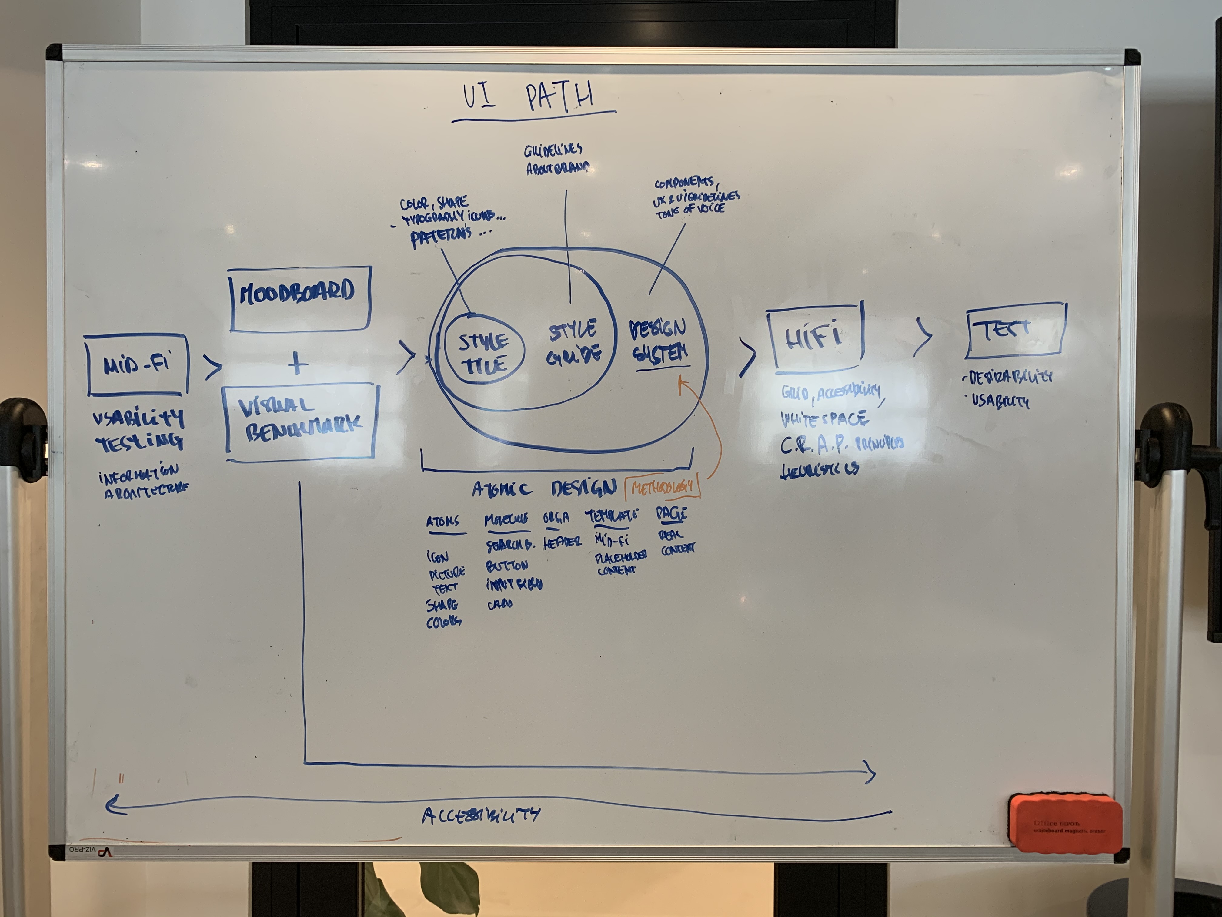
Unlike UX lessons (which included workshops), UI topics like Moodboards, Typography, and Grids lacked hands-on practice before students applied them to projects.
3. Students Craved Personalized Feedback
[I would like] more feedback about the solution feasibility than formal comments.
[I would like] more feedback about our prototype itself (rather than on the interview).
Despite daily monitoring and presentation feedback, students wanted more specific, actionable guidance on their work.
4. They Felt Lost and Wanted More Guidance
You should tell us: do this first. That's the minimum for the project to work, then if you have time and feel advanced, do this and that.
Should give more detailed goals that should be achieved each day.
I feel lost.
Students expected us to hand them priorities and tell them what to do next.
The Breakthrough: Reframing the Problem
These pain points felt tactical—delivery issues we could fix with better lesson plans or more workshops. And we did deploy quick wins along the way (more on that later).
But during one-on-ones, I heard a different story. Students weren't just complaining about lesson delivery. They were sharing genuine fear about their career choice:
Will I be good enough to get hired?
This was impostor syndrome at scale. The root causes were deeper:
- Information overload creating cognitive overwhelm
- Insufficient UI practice reducing confidence
- Personal blind spots going unaddressed
- Lack of strategic vision making them feel like order-takers, not designers
The reframed problem:
How might we help students overcome the tenacious fear of not being enough?
The answer wasn't just better UX/UI balance or more feedback. We needed to develop a strategic vision for what kind of designer we were shaping.
The Solution: Engineering a Learner-Centered Curriculum
We introduced a revolutionary pedagogical approach centered on self-directed learning and learner experience design. Our north star:
Develop independent Product Designers—capable of composing a Design plan that answers the right problem for users, aligns with business goals, and accounts for time and resources available.
Our Three-Pillar Approach:
- Practice Above Theory in All Design Areas
- Empower Students to Create Their Own Reasoned Toolkit
- Shape Independent Strategic Designers, Not Generic Pixel-Pushers
Success metric: Clients see Design as a strategic tool for product vision, and designers as strategic beings who make that vision possible.
How We Got There: Curriculum Engineering in Action
1. Practice Above Theory
The bootcamp was rooted in practice, but not enough. Students agreed. As Academic Program Manager, I redesigned the learning experience architecture:
We adapted existing Workshops and added new ones. Used Roleplay Protocols
These weren't just activities—they were curriculum artifacts with detailed facilitation guides, timing breakdowns, materials lists, and learning objectives mapped to our competency framework.
2. Empowering Self-Directed Learning
We restructured the curriculum to develop student autonomy:
Peer Feedback Systems:
During Dry Runs, Design Critiques, and presentations, students received as much (if not more) input from peers as from teachers. This forced them to exercise critical thinking and formulate constructive feedback.
Teaching principle: Feedback should be constructive, frequent, and action-oriented.
Retrospectives After Group Projects:
Students reflected on time management, priorities, deliverables, and team collaboration. This developed their organizational process and implementation strategies—critical for project management.
Self-Organized Time Management:
Students controlled how they utilized their time, forcing them to evaluate workload, prioritize tasks, delegate, and adjust project scope.
3. Shaping Strategic Designers
The Kickoff Strategy Workshop (Final Project Innovation):
Previously, students passively received briefs from clients. This created issues:
- Blurred briefs
- Clients misaligned with user needs
- Students feeling like order-takers
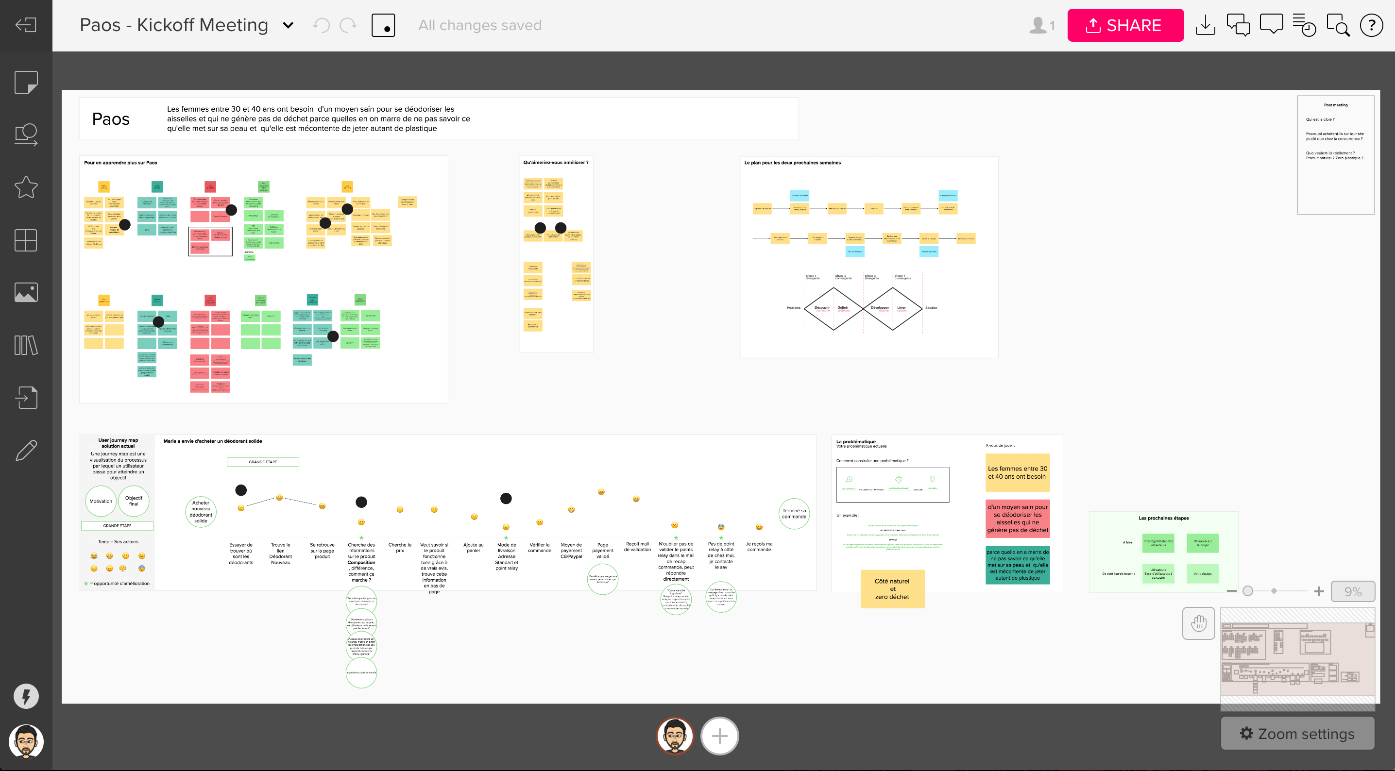
I designed a Kickoff Strategy Workshop where students facilitated strategy sessions with clients, helping them develop a real Product Design vision.
Curriculum artifacts created:
- Workshop facilitation guide
- Stakeholder interview templates
- Strategy canvas frameworks
- Client communication protocols
The mindset shift we coached:
The client will learn so much about their own project. They'll thank you for it.
And they did. Every time.

Scaling Remote: Our Biggest Challenge
When Ironhack launched its first remote bootcamp, it struggled. The experience wasn't optimized, engagement was inconsistent, and demand remained low. But we saw potential. Over the next 12 months, we iterated relentlessly—testing pedagogical approaches, refining delivery methods, and gathering feedback from early remote cohorts.
As results improved and word spread, remote learning became the new standard. Then demand exploded. Suddenly, we needed to scale what had been an experimental format into a core offering that could match the quality of our established in-class programs.
This wasn't about Zoom-ifying our in-class experience. It required fundamental curriculum redesign.
The Challenge:
- Maintain engagement in remote environments
- Ensure consistent quality across time zones
- Support instructors who'd never taught remotely
- Adapt hands-on workshops for digital delivery
- Scale from experimental to mainstream without sacrificing quality
Our Revolutionary Approach:
Short Lectures (15-20 minutes max):
Replaced hour-long lectures with focused micro-lessons, maintaining attention and allowing frequent breaks.
Lecture Discussions:
Built in structured discussion time after each concept, using breakout rooms for small-group dialogue.
Few Key Points:
Reduced cognitive load by focusing each lesson on 2-3 core takeaways instead of comprehensive coverage.
Visual Aids & Handouts:
Created rich visual curriculum materials students could reference asynchronously, reducing note-taking burden during live sessions.
Demonstration-Based Learning:
Increased live demonstrations (tool usage, design critiques, facilitation modeling) so students could see thinking processes, not just outcomes.
Creating Positive Learning Environments:
Developed protocols for remote community-building: virtual coffee chats, Slack channels for peer support, celebration rituals for milestones.
Instructor Support:
Created comprehensive remote teaching playbooks, conducted training sessions, and established peer mentorship among instructors.
The transformation took patience. Those first 12 months of iteration—learning what worked and what didn't—were critical. By the time demand exploded, we had a proven system ready to scale.
Working in Agile: Continuous Improvement at Scale
Our process was Lean and iterative:
Sprint Cycle:
Each bootcamp cohort = one release cycle (9-10 weeks)
Weekly Standups:
Product Manager, Instructional Designers, and I reviewed student feedback, identified blockers, prioritized improvements
Retrospectives:
After each cohort, we conducted team retros analyzing what worked, what didn't, and what to try next
Backlog Management:
Maintained a prioritized list of curriculum improvements, from quick wins to major redesigns
Fast Time to Market:
Some improvements deployed mid-cohort when students needed immediate help
Outcomes & Impact
Immediate Outcomes
Project Unblocked at Scale:
Successfully transitioned entire global curriculum to hybrid delivery model in 6 months
Instructor Alignment:
20+ instructors across 9 campuses now had consistent materials, training, and support systems
Student Success Metrics:
- 90% job placement rate within 3 months of graduation
- 2,400+ students supervised annually with consistent quality standards
- Graduates hired at: Pennylane, Red Cross, SNCF Connect, Mirakl, Ledger, GitGuardian, Orange, Thales, UX Republic, Idean, Valtech
Client Partnerships:
Attracted companies like Vestiaire Collective, Welcome to the Jungle, Konbini, and Payfit to sponsor final projects, trusting our students to improve their products.
Strategic Impact
Curriculum as Product:
Demonstrated that curriculum engineering requires the same rigor as product design—user research, iterative development, quality assurance, and continuous improvement.
Scalable Quality:
Proved that bootcamp education can maintain high standards while scaling globally, when curriculum is engineered as a system rather than individual lessons.
Pedagogical Innovation:
Our learner-centered, self-directed approach became a model for other programs at Ironhack and influenced the broader bootcamp industry.
Teacher Empowerment:
Instructors reported feeling more confident, supported, and effective with comprehensive curriculum materials and ongoing training.
Key Lessons
1. Curriculum Engineering Is Product Design
The skills are identical: user research, persona development, journey mapping, iterative prototyping, quality assurance. The artifacts are just different (lesson plans instead of wireframes).
2. You Can't Scale What You Don't Systematize
Individual great teachers don't scale. Systems that enable any qualified teacher to deliver great experiences do. Curriculum engineering is about building those systems.
3. Three Personas, One Ecosystem
Designing for teachers, TAs, and students simultaneously creates a multiplier effect. When teachers have better tools, TAs can provide deeper support, and students receive more consistent experiences.
4. Self-Directed Learning Requires Scaffolding
You can't just tell students "figure it out yourself." You must engineer the curriculum to gradually release responsibility, building their autonomy muscles over time.
5. Remote Learning Isn't Worse—It's Different
With intentional design, remote learning can be as effective as in-person. It requires different pedagogical approaches, but the fundamentals remain: engagement, practice, feedback, community.
6. Agile Works for Education
Treating curriculum as a product with sprint cycles, backlogs, and retrospectives enabled us to respond quickly to student needs while maintaining strategic direction.
Final Reflection
This project fundamentally changed how I think about education and design.
As a teacher, I helped 150+ students transform their careers. As an Academic Program Manager, I designed systems that helped 2,400+ students annually—and will continue helping thousands more.
The transition taught me that the highest leverage point isn't always direct service delivery. Sometimes it's designing the systems, tools, and processes that enable others to deliver at scale.
Curriculum engineering sits at the intersection of instructional design, product management, and UX design. It requires:
- Empathy for three distinct user groups with competing needs
- Systems thinking to see how curriculum components interconnect
- Facilitation skills to align cross-functional teams (PMs, Instructional Designers, Teachers)
- Strategic vision to balance immediate student needs with long-term program goals
- Agile mindset to iterate rapidly based on feedback
When I think back to those early days as a teacher, frantically preparing lessons the night before, to later engineering curriculum systems used by 20+ instructors globally—I'm reminded that design is ultimately about creating conditions for success.
Sometimes that's designing an interface. Sometimes it's designing a workshop. And sometimes it's designing an entire learning ecosystem.
The principles don't change. The impact just scales.
This project took place during my time at Ironhack, first as Lead Product Design Teacher (2019-2021), then as Academic Program Manager (2021-2023). Some details have been adjusted for confidentiality, but the story and lessons are real.